/Marie_Frignet

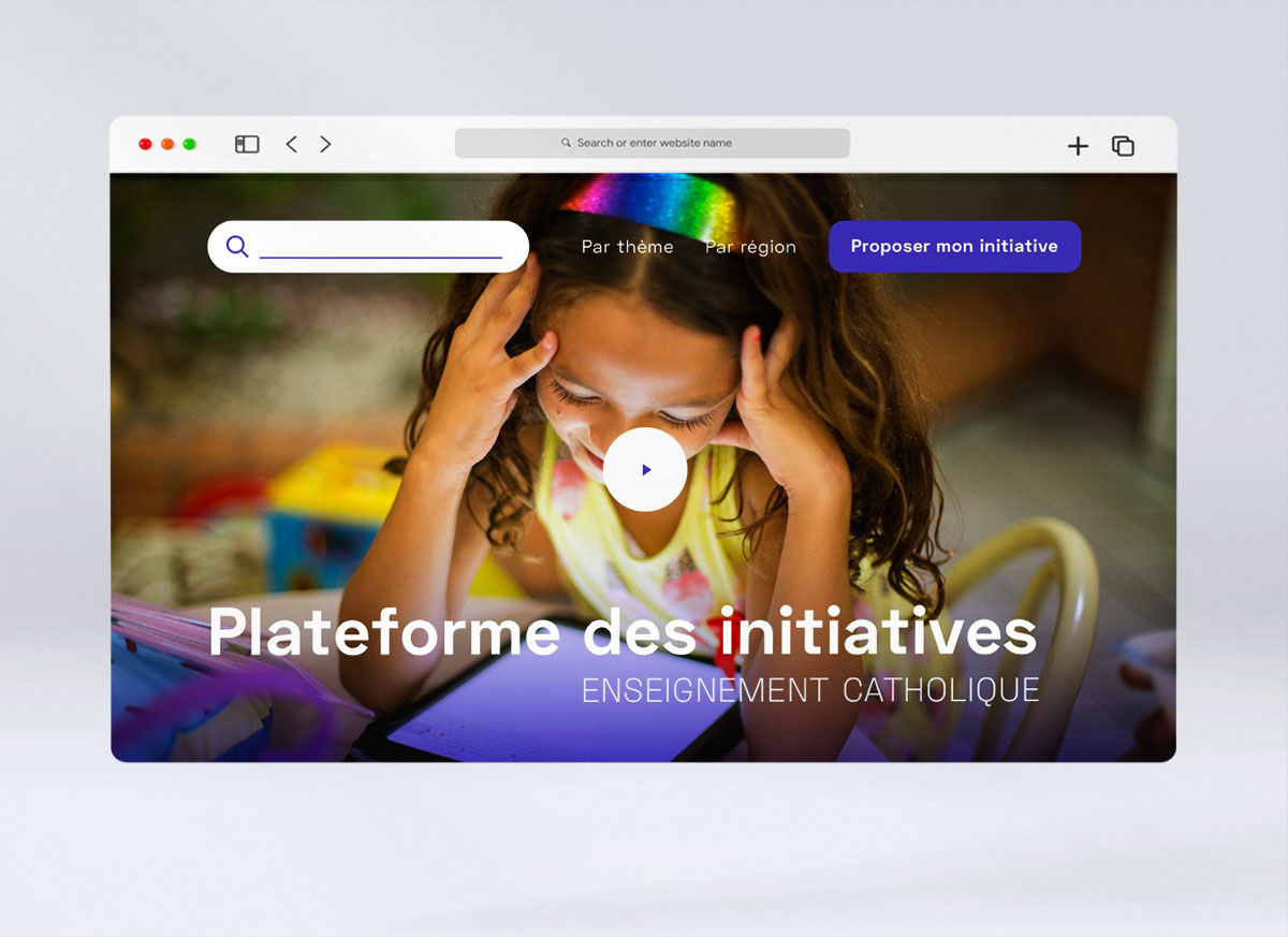
Plateforme des initatives

Le Secrétariat Général de l’Education Privé est à l’origine de nombreuses initiatives pédagogiques et éducatives (création d’un club d’échec, d’un atelier de réalisation d’attrapes-rêves), grâce à ses nombreux acteurs.

La plateforme permet de rassembler ces nombreuses initiatives. Il a fallu ici trier le vaste contenu de ses actions, trouver un CMS adéquat et mutualiser le travail d’un expert en SEO, un développeur ainsi que celui de l’UX/UI designer (moi-même) pour réaliser ce projet.

Concernant l’UX/UI Design, l’idée était de rendre lisible et surtout ludique ces contenus.

The General Secretariat of Private Education, thanks to its many actors, is at the origin of many pedagogical and educational initiatives (a chess club opening, a dream catchers workshop) and wanted to bring together these many initiatives. Here we had to sort out the vast content of its actions, find an adequate CMS and pool the work of an SEO expert, a developer and UX / UI designer (myself) to carry out this project. UX / UI Design, the idea was to make this content readable and above all fun.


/Marie_Frignet

Office Français de la Biodiversité

L’Office Français de la Biodiversité contribue à la protection et à la préservation de la biodiversité en France.

Pour le secteur de l’Estuaire de la Gironde et de la mer des Pertuis, l’OFB avait besoin d’un site de publication en interne de leurs documents de recherche. L’interface a été conçue pour pouvoir à la fois naviguer au niveau de la cartographie comme dans l’éventail de documents publiés par l’office, tout en respectant la charte graphique de l’institution.

The French Biodiversity Office contributes to the protection and preservation of biodiversity in France. For the Gironde estuary and the Pertuis sea sector, the OFB needed an internal publication site of their research. The interface has been designed to be able to navigate both at the level of cartography and in a range of documents published by the office, while respecting the graphic charter of the institution.

/Marie_Frignet

Licht

Licht est une entreprise de conseil et d’accompagnement en stratégie et management des entreprises. Pour accompagner l’ouverture de nouveaux pôles au sein de l’entreprise, Licht a souhaité revoir le design de son site.

Pour la refonte de site, à la demande du client, j’ai conservé le logo et les couleurs chaudes et vives de la charte de la marque.

L’utilisation d’éléments graphiques et photographiques donne à l’ensemble un certain dynamisme, valeur importante de la société. Tout en suivant les tendances, le design se démarque par l’usage des couleurs vives, d’une trame graphique originale et d’éléments graphiques impactants.

Licht is a consulting and support company in business strategy and management. To support the opening of new poles within the company, Licht wanted to review the design of its site. For the website redesign, I kept the logo and the warm and bright colors of the brand charter. Using of graphic and photographic elements gives dynamism, an important value of the company. While following trends, the design is distinguished by using bright colors, an original graphic frame and impactful graphic elements.

/Marie_Frignet

OpenWork

OpenWork est une société de portage salarial, qui met en relation des consultants et des entreprises en besoin de missions ponctuelles. Sur ce projet j’ai travaillé en collaboration avec Jungle Program.

Pour la refonte de site, à la demande du client, j’ai conservé le logo et les couleurs de la charte en utilisant un tonalité plus froide et plus sombre pour contraster avec l’orangée de l’identité visuelle. L’utilisation des illustrations permet de mettre en avant les valeurs d’humanité qui correspondent à la société OpenWork.

Pour ce site, il a fallu concevoir différentes fonctionnalités qui correspondent aux besoins des utilisateurs tels qu’un simulateur de chiffre d’affaire, un profil « consultant » ou « employeur », une page « événement », un blog, etc…

OpenWork is a salary portage company, which connects consultants and companies in need of one-off missions. On this project I worked in collaboration with Jungle Program. For the site redesign, at the request of the client, I kept the logo and the colors of the graphic guide lines using a cooler and darker tone to contrast with the orange of the visual identity. The use of illustrations highlights the values ​​of humanity which correspond to the company OpenWork. For this site, it was necessary to design various functionalities which correspond to the needs of the users such as a turnover simulator, a « consultant » or « employer » profiles, an « event » page, a blog, etc …

/Marie_Frignet

Convention Citoyenne pour le Climat

Le conseil économique, social et environnemental (CESE) a eu pour mission l’organisation de la Convention citoyenne pour le climat, 150 citoyennes et citoyens, tirés au sort, devront proposer des recommandations pour lutter contre le réchauffement climatique.

J’ai travaillé sur le logotype de cette nouvelle convention citoyenne en collaboration avec l’agence NDBD.
L’utilisation graphique du cercle représente ici l’Hémicycle mais aussi la Terre, tout en reprenant les 3 “c” des trois termes principaux du titre. La circonférence du cercle évoque le mouvement et le changement. La forme ronde évoque également les échanges, le dialogue, le cercle de discussion. Le rond, le cercle est une forme associée également à l’organique, à la nature. Très simplifié, le graphisme s’ouvre comme une bulle de dialogue.

The Economic, Social and Environmental Council (CESE) was tasked with organizing the Citizen’s Convention for the Climate, 150 citizens, randomly chosen, will have to propose recommendations to fight against global warming. I’ve worked in the logo of this new citizen convention in collaboration with the NDBD agency. The graphic use of the circle here represents the Hemicycle and the Earth, while using the 3 “c” of the three main terms of the title. The circumference of the circle evokes movement and change. The round shape also evokes exchanges, dialogue, the discussion circle. The round, the circle is a form also associated with the organic, with nature. Very simplified, the shape opens like a speech bubble.

/Marie_Frignet

24S – Le Bon Marché

La boutique du Bon Marché (www.24s.com), nécessite une animation commerciale constante et percutante afin de rester à la pointe des tendances et de la mode.

J’ai donc participé, ici, à la mise à jour des visuels sur le moyen terme de la boutique en ligne en utilisant des codes graphiques novateurs et colorés.

The Bon Marché boutique (www.24s.com) requires constant and impactful commercial animation in order to stay at the forefront of trends and fashion. I have therefore participated here in updating the visual assets of the online store using innovative and colorful graphic codes.

/Marie_Frignet

Nescafé Dolce Gusto

Pour la sortie de sa dernière machine à café, Nescafé axe, en partie, l’innovation sur la présence d’une petite interface graphique sur la machine. Un UI et UX particulier doit être conçu pour ce type d’usage tout en intégrant le large choix de capsules et de type de boisson proposées par la machine (en collaboration avec l’agence Ogilvy).

For the release of its latest coffee machine, Nescafé focuses on innovation on the presence of a small digital interface on the machine. A particular UI and UX must be designed for this type of use while integrating the wide choice of capsules and type of drink offered by the machine (in collaboration with the Ogilvy agency).

/Marie_Frignet

Générale d’Optique

Pour la refonte du site web de la marque d’opticien Générale d’optique, l’ensemble de l’UI desktop et mobile a été revu. J’ai donc modernisé le design tout en respectant l’aspect à la fois séduisant, grand public et médical de la marque. La complexité de l’architecture (configurateur de lunettes, ordonnance, 2e paire) implique une simplicité et une grande cohérence dans la navigation.

For the redesign of the website of the Générale d’optique brand, the entire desktop and mobile UI has been reviewed. So I modernized the design while respecting the attractive, main-stream and medical aspect of the brand. The complexity of the architecture (glasses configurator, prescription, 2nd pair) implies simplicity and great consistency in navigation.